 If you have ever added space between elements on a page and thought “Why isn’t this lining up the way I expected? You are not alone!
Understanding the difference between padding, margin, and how spacing units (px, em, rem, % and VW) work is one of the first steps in creating a polished, professional-looking website.
In this post, we’ll review:
- The difference between padding and margin
- What px, em, rem, % and vw mean
- When to use them to make you website look great on any device.
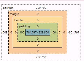
What Is Padding?
Padding adds space inside an element this space added between the content (like text or images) and its edge or background of that element.
Think of it like the mat inside a picture frame. It keeps the content of image aren’t “cramped” against the edge.
When to use padding:
- To create space inside a box(container), buttons or text areas.
- To expand the colored background area around the text or images. This makes the text easier to read.
- To make sections of a page feel more open without moving other elements on the page.
What Is Margin?
Margin adds space outside of an element. Separating it form the next element above, below or to either side of it.
Think of margin as the space between two picture frames on a wall. It does not change the size of the frame; it just controls how close or far apart they hang on the wall.
Example: If your headline feels too close to a paragraph, increasing the bottom margin on the headline will create visual separation/distance.
When to use margin:
- To control the spacing between containers, columns, or widgets.
- To push element apart or bring them closer together.
- To adjust layout alignment without changing inner spacing.
The 5 Most Common Units Explained
Now that you know what padding and margin do, let’s cover how to measure them with the five different units you could use.
px (pixels)
What it is: A fixed, exact measurement on the screen. One pixel equals one tiny dot on the screen.
How it behaves: Does not scale when text size or screen size changes. Use if you want precise control that doesn’t scale with screen size. Great for small details like icon spacing, button padding, or tight layouts.
When to use:
- When you need precise, fixed spacing, like borders, icons, or small adjustments
- On desktop-only layout where you want exact visual control
Example: padding: 20px adds exactly 20 pixels inside the element on every device (unless overridden in responsive mode).
% (Percent)
What it is: Relative to the parents container size.
How it behaves: As the parent container grows or shrinks, the spacing adjust in proportion.
When to use:
- When you want fluid layout s that adjust to different screen widths.
- Ideal for containers or columns that scale with browser size.
- Use when you need dynamic spacing but don’t need exact measurements.
Example: margin: 5% means that the margin will be 5% of the parent container’s width. Smaller on mobile and larger on desktop OR a column with 5% side padding maintains even spacing regardless of screen width.
em (relative to element font size)
What it is: 1 em equals the font size of the element itself.
How it behaves: If your paragraph has a font size of 16px, them 2em = 32px. If you increase the font size, spacing automatically adjusts.
When to use:
- When you want the spacing to grow or shrink based on the text size of that specific element.
- Common for buttons or containers that have text
Example: 1.5em gives larger buttons more space without manual resizing. A heading box that adjusts padding when you change the headings font size.
rem (relative to root font)
What it is: 1 rem equals the root font size (usually defined on your theme’s HTML or global settings and is usually 16px.
How it behaves: Rems scale consistently across your site. If you increase your global font size, spacing adjusts proportionally everywhere. P
When to use:
- For consistent, scalable spacing across your entire site.
Example: If your root font is 16px, then 2rem = 32px on all elements, regardless of their individual font sizes.
vw (viewport width)
What it is: 1vw = 1% of the viewport’s width (the visible browser window)
How it behaves: As the browser resizes, spacing scales proportionally to the screen width not to the width of the element or parent.
When to use:
- For full-width hero sections or design that must adjust dynamically.
- For text or layouts that need to maintain proportional balance across large screens.
- Great for creating visual drama in responsive designs.
Example: padding: 20px adds exactly 20 pixels inside the element on every device (unless overridden in responsive mode).
Common Tips & Mistakes to Avoid
- Use padding when you want to create space inside an element. Create distance within an element.
- Use margin when you want to create space outside and element. Create distance between elements.
- Don’t stack large pixel values across multiple sections/containers/elements as it can “break” the mobile layout.
- Stick with one or two unit types within one layout. Mixing units too freely leads to inconsistent responsizeness.
- Be careful when using negative margins as they can cause overlapping issues on small screens.
- Using only pixels can cause designs to break on mobile devices.
Wrap Up
Padding and margin are small details that make a big difference. Once you understand how they work and which units to use, your layouts will look more professional and cohesive.
The more you experiment, the easier it becomes to visualize the space you are creating and how it will behave based on the device, browser, screen size and orientation.
✨ Inside the Website Foundations Course, we review in depth spacing, alignment and responsive design principles. So you can build a website that feels balanced, beautiful, and entirely on brand.


